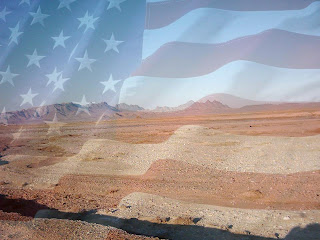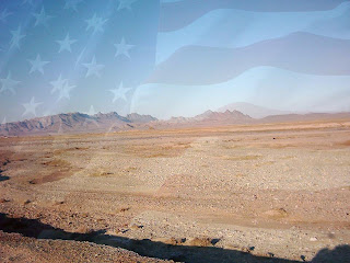
 They are ordered from darker flag to lighter flag. I don't really know which one will work best once I put the plane in. If ya'll could comment and tell me which one you think would work best I would really appreciate it. Or if you have any other suggestions on color, etc. I would love that as well!
I like the third one the best, since it's much easier to make out the desert and the flag is more subtle but still visible enough.
ReplyDeleteI personally think that the middle one is your best option. I think it might be cool if you gave the desert a sepia tone to give it more of a rustic, dry look.
ReplyDeletei like the bottom one as well just because the flag isnt as noticable, it looks more natural.
ReplyDelete